Design shapes, art reveals,
and music remembers.
Creating great
website experiences
A memorable
logo design
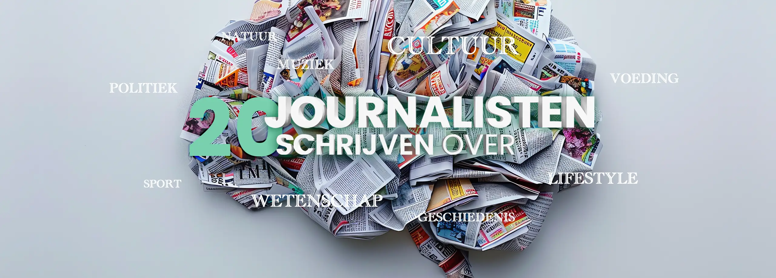
Tikanna music
and sound design
website
development
showcase
_blank has expertise in
creating successful custom
online campaigns.
I collaborated with companies large and small to help them engage their audiences and build online identity awareness. Through this I have developed knowledge of web design and digital marketing from over 250+ projects.
To accomplish a strong online user experience and custom presence for you and your organisation, I implement a web development process consisting of:
• Aligned interviewing & • Project research
• Identity analysis & • Branding goals
• Functional design & • UI/UX Design
• Visuals & Motions & • Illustration
• Website building & • Mobile and tablet responsive
• Custom CSS and animations & • Testing, services and training
• Aligned interviewing
• Project research
• Identity analysis
• Branding goals
• Functional design
• UI/UX Design
• Visuals & Motions
• Illustration
• Building website
• Mobile and tablet responsive
• Custom CSS and animations
• Testing, web-services and
training
_blank executes anything in design that is related to the online campaign. From photography, illustrations, logo / branding, mailings, animations, designing print to other offline and online materials.
Creatief Schrijven
Open project
The Sound Within
Open project
Bureau Wibaut
Open project
PurPorc
Open project
QUSOFT
Open project
Holychick
Open project
logo
A memorable logo is your beacon
DESIGN
_blank assists customers in defining the essence and the character of the company or organization. Subsequently, creating the logo as the fundamental element of the visual identity, allowing it to evolve into a brand.
The design philosophy is that the strenght of a logo lies in its simplicity. A logo distills complex ideas into a single, elegant design. Like a masterful poem, it speaks volumes with just a few carefully chosen elements.
Quantum.Amsterdam
Open project
Hungry Mind
Open project
Evolve in Music
Open project
Loft der Zotheid
Open project
Woordkracht
Open project
MUSIC
& Sound Design
tikanna
Keep Hope
Open project
Tikanna - Touch
Open project
Studio Plantaardig
Open project
The mythology of
modern love
Open project
Earthly Resonances & Electronic Modulations
Two frequency currents combined into one music narrative, creating a movie of sound. This music, produced under the artist name Tikanna, is used within websites, films, documentaries, art-installations and podcasts.
Personally, I find the true beauty in art, design and music in the creative process itself.
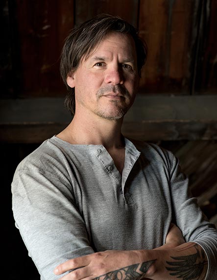
Marlon is an experienced graphic and interaction designer who worked for the last 28 years for various advertising and design agencies and operates under the name _blank. In addition to this, Marlon works as a sound designer and digital design teacher to share his knowledge and experiences.
“With each project, I embark on a journey to research the unique story my clients hold. It is within these narratives that I discover the essential elements to craft a design, identity or online strategy. One that seamlessly translates through functional and interactive design: The User Interface.”
/// Main studies:
Sound Education Netherlands – Pro audio engineer & Music Producer
(Cum Laude)
Gerrit Rietveld Academy – Unstable media & Interaction designer
(Nominated for most talented graduate students in 2012 in the field of media art and digital culture)
Graphic Lyceum Eindhoven & Rotterdam – Graphic designer
Graphic Lyceum Eindhoven KMBO – Print preparation, printing and silkscreen